Auto Layout + Shared Components: วิธีสร้าง Design System ใน Figma ที่ Scale ได้จริง
คู่มือปฏิบัติสำหรับการใช้ Auto Layout และ Shared Components ใน Figma เพื่อสร้าง design ที่ consistent ข้ามหลายโปรเจค — จากประสบการณ์จริงในการดูแล Design System ระดับองค์กร
ทำไมต้อง Auto Layout?
ถ้าคุณยังทำ design ใน Figma แบบลาก element ไปวางตำแหน่งแบบ manual — คุณกำลังทำงานแบบ 2020
Auto Layout คือ feature ที่ทำให้ elements ใน frame จัดตัวเองอัตโนมัติ — เหมือน CSS Flexbox แต่อยู่ใน Figma ไม่ต้องเขียน code
ทำไมมันสำคัญ:
- Resize ได้โดยไม่พัง — เปลี่ยนความกว้างแล้วทุกอย่างปรับตามอัตโนมัติ
- เพิ่ม/ลบ content ได้เลย — เพิ่มอีก 1 item ใน list ไม่ต้อง manual ขยับทุกอย่าง
- Consistent spacing — padding และ gap เป็นค่าตายตัว ไม่มีวันเพี้ยน
- Developer เข้าใจง่าย — เพราะ Auto Layout ทำงานเหมือน Flexbox ที่ dev ใช้อยู่แล้ว
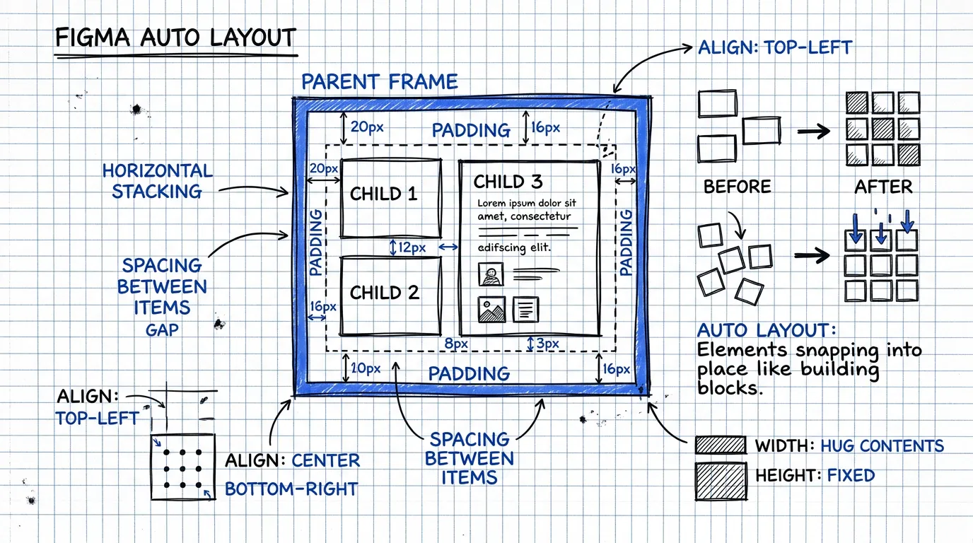
Auto Layout 101: เริ่มจากศูนย์
Horizontal vs Vertical Layout
มีแค่ 2 ทิศทาง:
- Horizontal (→) — elements เรียงแนวนอน เหมือน
flex-direction: row - Vertical (↓) — elements เรียงแนวตั้ง เหมือน
flex-direction: column
Padding คือ "ระยะขอบ"
Padding คือระยะห่างระหว่าง ขอบ frame กับ content ข้างใน
- ตั้งเท่ากันทุกด้าน:
padding: 16 - ตั้งแยกแต่ละด้าน:
top: 24, right: 16, bottom: 24, left: 16
Gap คือ "ระยะห่างระหว่าง items"
Gap คือระยะห่างระหว่าง element แต่ละตัว ภายใน frame
- ค่าที่ใช้บ่อย:
8,12,16,24 - ใช้ค่าจาก spacing scale ของ design system เสมอ
Alignment
กำหนดว่า items จะจัดตัวยังไงภายใน frame:
- Top-left, Center, Bottom-right ฯลฯ
- Space between — กระจายเท่าๆ กัน (เหมือน
justify-content: space-between)
Nested Auto Layout: สร้าง UI ที่ซับซ้อนจากชิ้นส่วนเล็กๆ
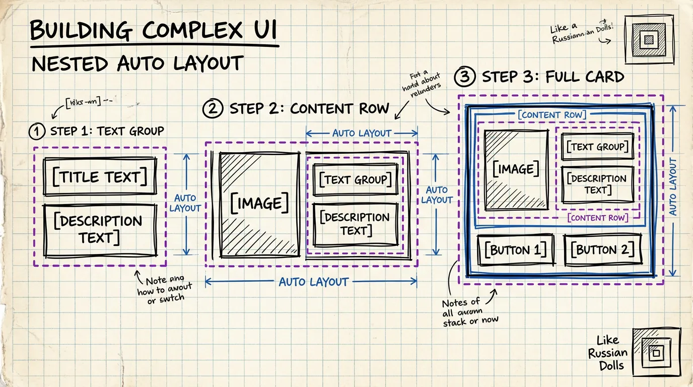
ความแรงจริงๆ ของ Auto Layout อยู่ที่การ ซ้อนกันหลายชั้น เหมือนตัวต่อ LEGO
ตัวอย่าง: สร้าง Product Card
ชั้นที่ 1 — Text Group (Vertical)
[Title]        ← text, bold
[Description]  ← text, regular
Gap: 4px
ชั้นที่ 2 — Content Row (Horizontal)
[Image] [Text Group]
Gap: 12px
Alignment: center
ชั้นที่ 3 — Card Body (Vertical)
[Content Row]
[Price + CTA Button]
Gap: 16px
Padding: 16px
ชั้นที่ 4 — Full Card (Vertical)
[Hero Image]    ← fill width
[Card Body]
Gap: 0
Border radius: 12px
ทุกชั้นคือ Auto Layout frame ที่ resize ได้อิสระ — เพิ่ม description อีก 2 บรรทัด card ก็ขยายอัตโนมัติ ย่อความกว้างลง ทุกอย่างก็จัดตัวใหม่
หลักการสำคัญ
- เริ่มจากข้างในออกมาข้างนอก — สร้างชิ้นส่วนเล็กที่สุดก่อน แล้วค่อยรวมกัน
- ทุกชั้นต้อง Auto Layout — ถ้าชั้นไหนไม่ใช่ Auto Layout มันจะเป็นจุดที่แตกเมื่อ resize
- ตั้งชื่อ layer ให้ชัดเจน —
Card/Body,Card/Content-Row,Card/Text-Groupไม่ใช่Frame 47
Component ที่ใช้ร่วมกัน: หัวใจของ Multi-Project Design
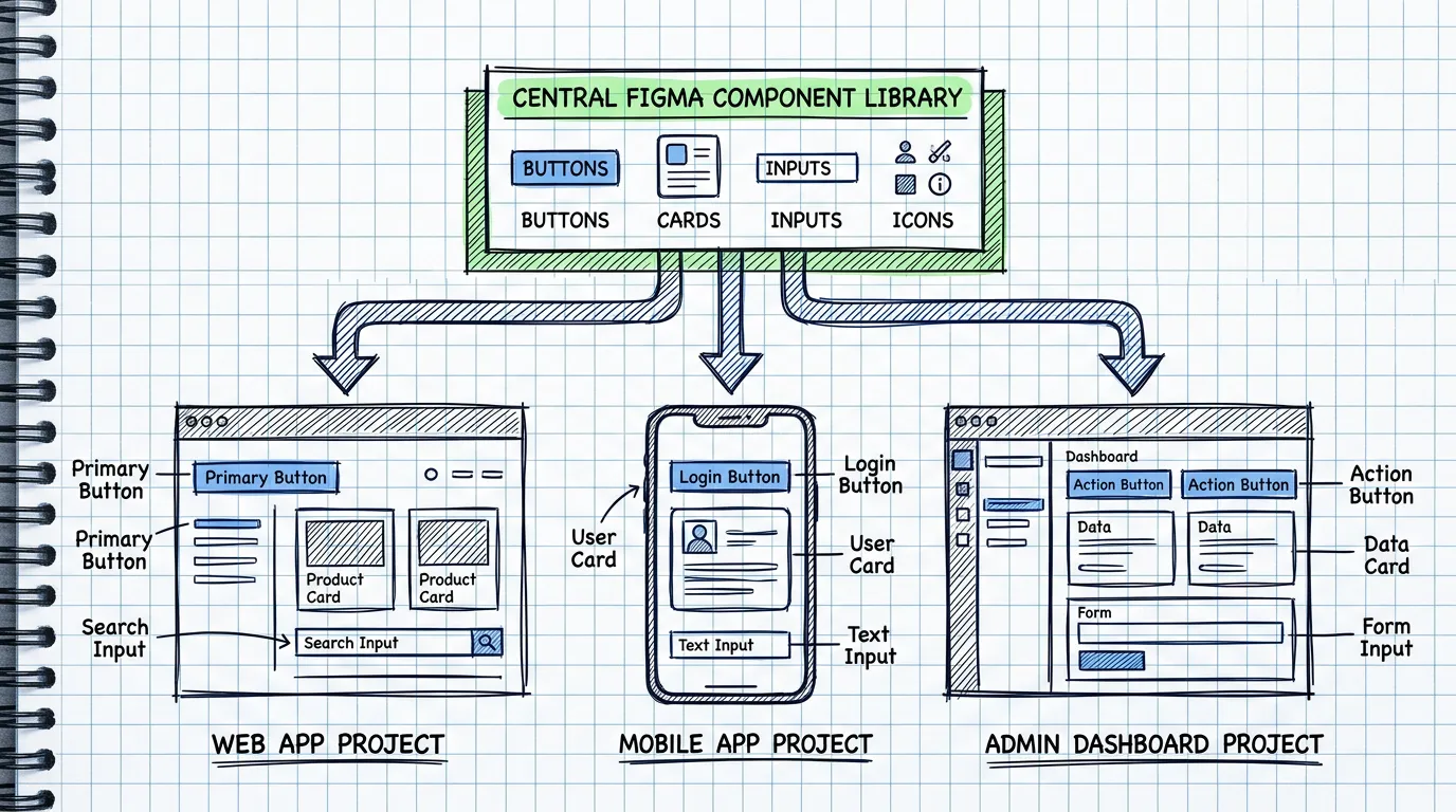
Auto Layout ทำให้ component ยืดหยุ่น แต่ถ้าแต่ละโปรเจคสร้าง component กันเอง มันจะ diverge ไปเรื่อยๆ จนไม่เหมือนกัน
วิธีตั้ง Shared Library
Step 1: สร้าง Figma file แยกสำหรับ Library
อย่าใส่ components ไว้ใน project file — สร้างไฟล์แยกที่เป็น "Single Source of Truth"
📁 Design System Library (Figma file)
├── 🎨 Colors & Tokens
├── 📝 Typography
├── 🔲 Icons
├── 🧩 Components
│   ├── Button
│   ├── Input
│   ├── Card
│   ├── Modal
│   ├── Navigation
│   └── ...
└── 📐 Layout Patterns
Step 2: Publish เป็น Team Library
ใน Figma ไปที่ Assets panel → Publish library ทุกโปรเจคในทีมจะเห็น library นี้และ drag component มาใช้ได้
Step 3: ทุกโปรเจค Enable Library เดียวกัน
Project A (Web App)       → Enable "Design System Library"
Project B (Admin Panel)   → Enable "Design System Library"
Project C (Mobile App)    → Enable "Design System Library"
เมื่อ update component ใน Library ทุกโปรเจคจะเห็น notification ให้ update — consistency อัตโนมัติ
Component Variants: หนึ่ง Component ครอบคลุมทุกกรณี
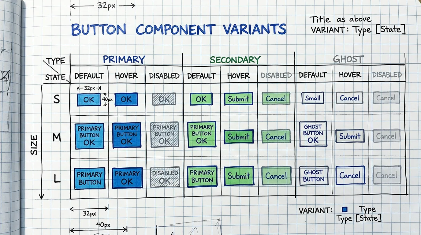
Component ที่ดีต้องรองรับทุกกรณีใช้งาน — ไม่ใช่สร้าง component ใหม่ทุกครั้ง
ตัวอย่าง: Button Component
ใช้ Component Properties ของ Figma:
Variant Properties:
- Type: Primary / Secondary / Ghost / Danger
- Size: Small (32px) / Medium (40px) / Large (48px)
- State: Default / Hover / Pressed / Disabled
Boolean Properties:
- Show Icon: true / false
- Show Badge: true / false
Instance Swap Properties:
- Icon: เปลี่ยน icon ได้ตาม context
Text Properties:
- Label: เปลี่ยนข้อความได้เลย
ผลลัพธ์
จาก 1 component คุณได้ button ที่ใช้ได้ทุกกรณี:
- Primary Large กับ icon → ปุ่ม CTA หลัก
- Secondary Small ไม่มี icon → ปุ่ม action ในตาราง
- Ghost Medium → ปุ่ม cancel ใน modal
- Danger Medium → ปุ่มลบ
ไม่ต้องสร้าง component ใหม่ ไม่ต้อง detach instance ไม่ต้อง override style
Auto Layout + Component = Responsive Design
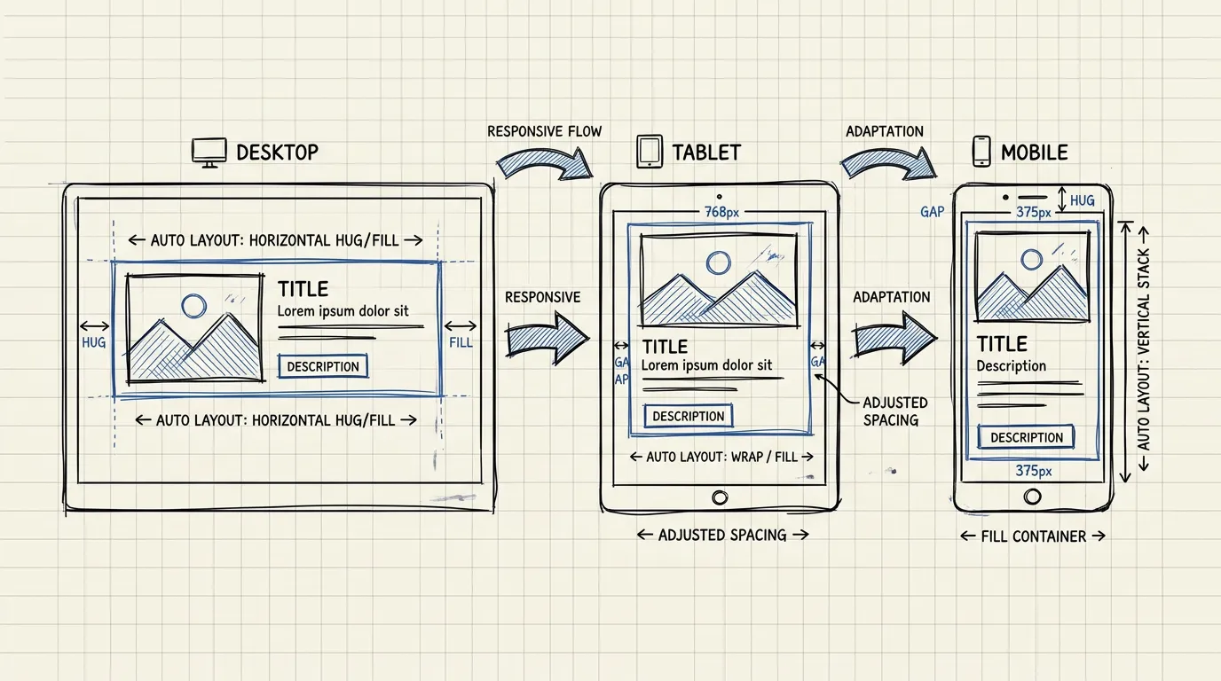
เมื่อ component ใช้ Auto Layout อย่างถูกต้อง มันจะ responsive โดยธรรมชาติ
Resizing Behavior
กำหนดว่า element จะ resize ยังไงเมื่อ parent เปลี่ยนขนาด:
- Fixed — ขนาดคงที่ ไม่เปลี่ยนตาม parent
- Fill — ขยายเต็มพื้นที่ที่เหลือ (เหมือน
flex: 1) - Hug — ขนาดตาม content ข้างใน (เหมือน
width: fit-content)
ตัวอย่าง: Card ที่ responsive
Card (Vertical Auto Layout, Fill width)
├── Image (Fill width, Fixed height: 200px)
├── Body (Vertical Auto Layout, Hug height)
│   ├── Title (Fill width, Hug height)
│   ├── Description (Fill width, Hug height)
│   └── Actions (Horizontal Auto Layout, Fill width)
│       ├── Price (Hug width)
│       └── Button (Hug width)
- Desktop (360px wide): Card แสดงปกติ text และ button เรียงแนวนอน
- Mobile (280px wide): ย่อลง text wrap ตัว button ยังอยู่ข้างๆ price
- List view (600px wide): ขยายออก content กระจายตัวสวยงาม
ไม่ต้องทำ design แยก 3 breakpoints — Auto Layout จัดการให้
Best Practices สำหรับ Multi-Project
1. ตั้ง Naming Convention ที่ชัด
ใช้ / เพื่อสร้าง hierarchy ใน Assets panel:
Button/Primary/Large
Button/Primary/Medium
Button/Secondary/Large
Card/Product/Horizontal
Card/Product/Vertical
Input/Text/Default
Input/Text/Error
ทุกโปรเจคจะเห็น component แบบ organized ไม่ต้องไล่หาจาก list ยาว
2. ใช้ Design Tokens
อย่า hardcode ค่าสีและ spacing — ใช้ Figma Variables:
- Colors:
primary/500,neutral/100,danger/600 - Spacing:
space/4,space/8,space/16,space/24 - Border Radius:
radius/sm,radius/md,radius/lg
เมื่อต้อง rebrand หรือเปลี่ยน theme แค่เปลี่ยน token values — ทุก component ใน ทุก project อัปเดตทันที
3. Document Component ใน Figma
ทุก component ควรมี:
- Description — อธิบายว่าใช้เมื่อไหร่
- Usage guidelines — dos and don'ts
- Link to code — ถ้าใช้ Code Connect ก็ link ไปที่ codebase component
4. Version Control
- ใช้ Branch ใน Figma เมื่อจะ update component ใหญ่
- Review ก่อน merge เหมือน code PR
- Changelog — บันทึกว่า version นี้เปลี่ยนอะไร
5. สร้าง Template Pages
นอกจาก components ให้สร้าง page templates ที่ประกอบจาก shared components:
📄 Templates
├── Dashboard Layout
├── Settings Page
├── Form Page
├── List/Table Page
└── Empty State
เมื่อเริ่มโปรเจคใหม่ แค่ duplicate template แล้วปรับ — ไม่ต้องเริ่มจากศูนย์
สิ่งที่ได้เรียนรู้จากการดูแล Design System ข้ามหลายโปรเจค
ข้อดี
- ลดเวลา design 40-50% — ไม่ต้องสร้าง component ใหม่ทุกครั้ง
- Consistency อัตโนมัติ — ทุกโปรเจคใช้ component เดียวกัน
- Onboard คนใหม่เร็ว — Junior เริ่มงานได้ทันทีเพราะมี component พร้อมใช้
- Handoff ง่ายขึ้น — Dev inspect component เดียว ใช้ได้ทุกที่
ข้อควรระวัง
- อย่า over-engineer — เริ่มจาก component ที่ใช้บ่อย (Button, Input, Card) ไม่ต้องทำทุกอย่างตั้งแต่แรก
- Maintain สม่ำเสมอ — Library ที่ไม่ update คือ library ที่ไม่มีคนใช้
- ฟัง feedback จากทีม — ถ้าคนในทีม detach instance บ่อย แปลว่า component ไม่ยืดหยุ่นพอ
- อย่าบังคับ — ให้คนเห็นประโยชน์เอง อย่าทำให้รู้สึกว่าเป็นภาระ
สรุป
Auto Layout + Shared Components ไม่ใช่ "nice to have" — มันคือ foundation ที่ทำให้ design team scale ได้จริง
เริ่มง่ายๆ:
- เปลี่ยน component ที่ใช้บ่อยที่สุดให้เป็น Auto Layout
- สร้าง Library file แยก
- Publish เป็น Team Library
- ให้ทุกโปรเจค enable library เดียวกัน
- ค่อยๆ เพิ่ม component ตาม priority
ไม่ต้อง perfect ตั้งแต่วันแรก — แค่เริ่มวันนี้
ปรึกษา UX ฟรี
กรอกข้อมูลสั้นๆ แล้วจะติดต่อกลับผ่าน LINE หรือ Email